Pasta Monsta!
Year: 2026
Medium: Packaging, logo, photography, and layout design
The Problem: Create packaging for a healthy pasta brand that appeals to children.
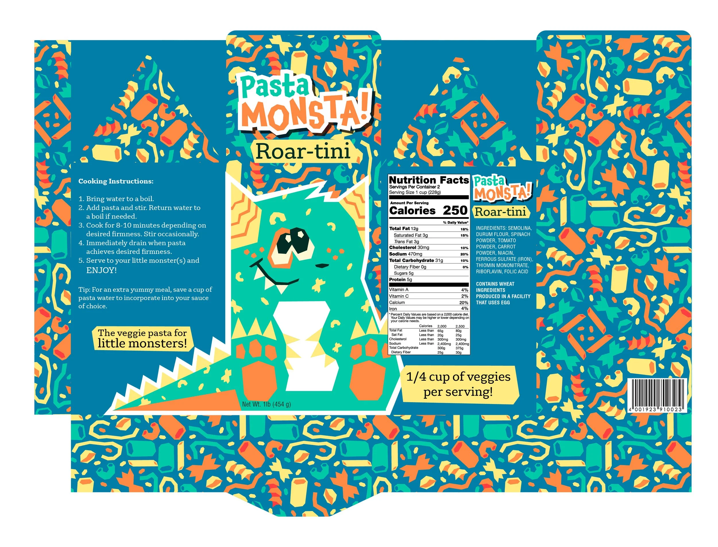
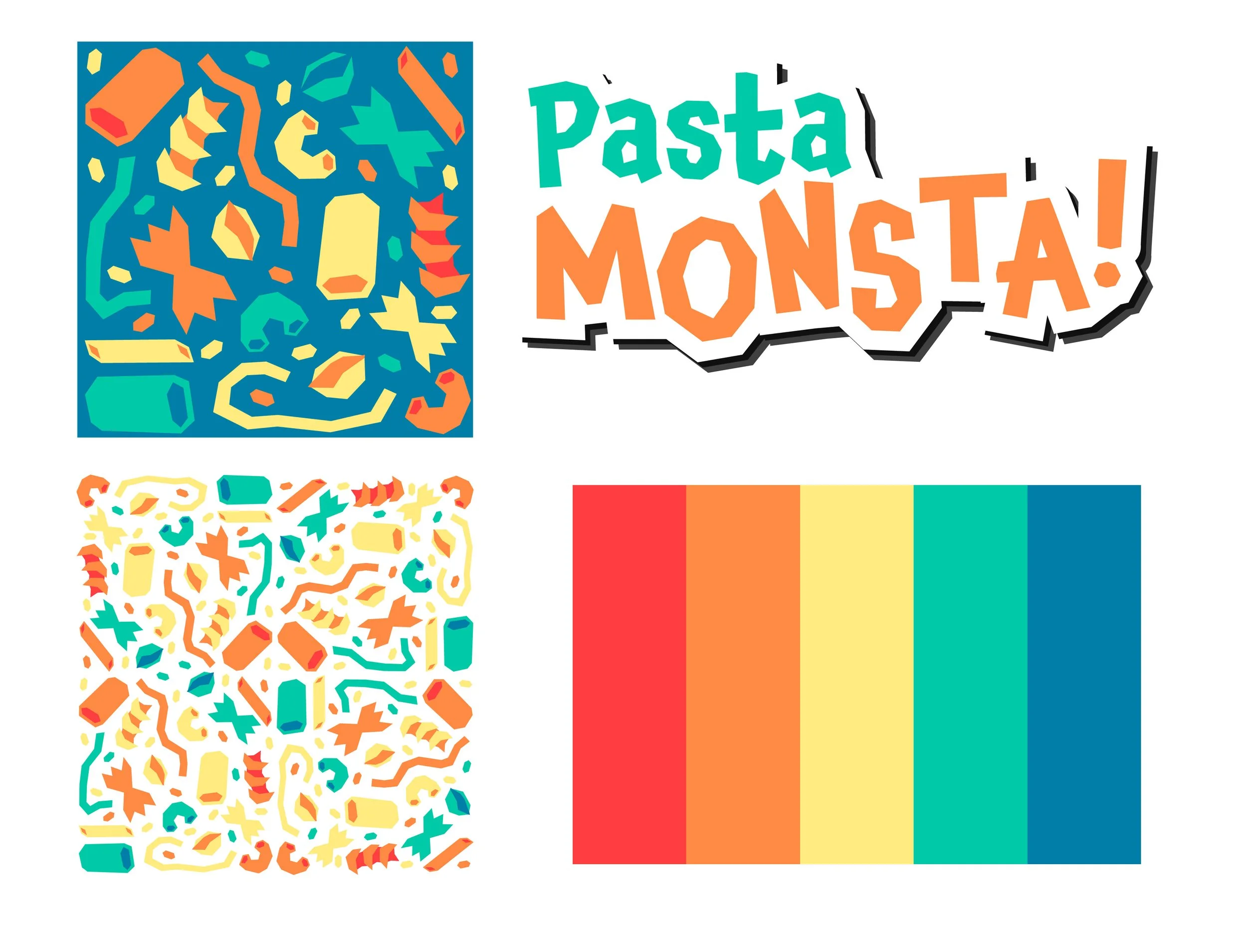
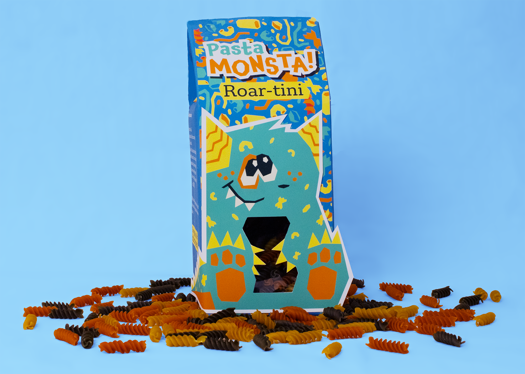
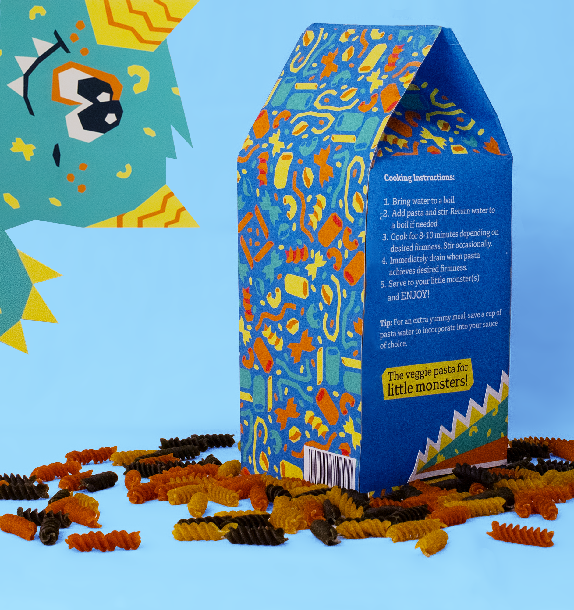
I created this design based on the marketing tactics many cereals use to grab children’s attention. While the cereal isle is chock-full of mascots and fun colors, the pasta aisle seems to be lacking. Most pasta brands stick to a homestyle or minimalist packaging. I wanted to tap into a more child-focused market, since pasta can be made with vegetable powders for added nutrients, and appeal to both children and their parents. Pasta Monsta uses a bright palette reminiscent of the reds, oranges, and greens in vegetables, fun patterns, and a large character on the front to help showcase the tri-color rotini inside. The box also is shaped like a carton for easier and more controlled pouring.
![JamieAntinore_Packaging[3].png](https://images.squarespace-cdn.com/content/v1/69308f10ec5db6045589b090/a8a93984-0398-4ad4-85fe-774dee0cfff9/JamieAntinore_Packaging%5B3%5D.png)